Companionable Reader,
The history of a font face (yes, it is true, that is what I intend to write here) is something that I certainly had never really considered. But my recent acquisition of some extraordinarily old papers* has toppled my previous indisposition towards the history of type, and has brought me up to a world of history far more fascinating than I could imagine for those particular Roman typefaces.
Times New Roman is, supposedly, the most widely used typeface in history; from books, to newspapers, to websites, to essays, it has become not only a staple of the British page, but has surely influenced the very way we see and understand letters. Going back six hundred years, Roman font faces would have seemed alien to the literate population of the time; the confusing array of regional black letter styles acting as a barrier themselves to reading the information they tried to record. How, then, did the whole of Europe change so much from that long established traditional style to the modern fonts we use today?
To begin my history of a font face, we need to go back to the civilization that bears its name; the Romans. Although several English letters don’t occur in the classical Latin that the people of Rome knew, the style of font face, called Serif, really flourished there and commonly appeared on carvings (although it actually has a basis in the even older Trajan scripts).
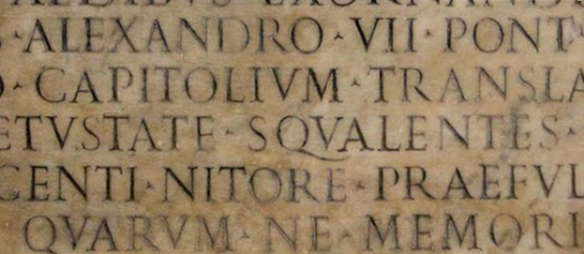
A Roman style inscription.
The term Serif (actually a modern term that people decided to start using in about 1800) comes from the characteristic lines attached to the ends of the main strokes of each letter. There’s several theories about why they were originally there – and yes, still here two thousand years later in our Times New Roman – but the presiding one at the moment is that they were originally flicks that occurred when the text designs were painted onto stone as stencils to be carved out. These flicks quickly became stylised, were pleasing to those ancient eyes, and have stayed ever since!
The Roman fonts spread throughout that ancient empire; even the illiterate Iron Age populations would have seen the style on the great public monuments that the Romans brought with them. These survived for the duration of the empire, until about the fifth century, when changing styles began to shift handwriting into a more rounded, simple style called Uncial.

Unical; the writing that developed out of the ruins of the Western Roman Empire.
By the 9th century, Uncial had developed into Carolingian, which had slightly more similarities to our modern lower case letters. (It was also one of the inspirations for the Hobbit style of handwriting Tolkien wrote about.) It was developed by several centres of learning across the Holy Roman Empire so that it would be easier for people to read books previously written in odd regional styles.

Carolingian; a writing created to make it easier for different parts of the Holy Roman Empire to communicate.
Then, by about 1200, things started to go a bit wrong. The unity of handwriting that had spread across most of Europe with Carolingian for some reason broke down, and Blackletter began to develop, with its own characteristics appearing from region to region. So, how did we go from this move away from any kind of Roman font to having every usual font we use today derived from Roman styles?
By the beginning of the fifteenth century, there was an eclectic array of Blackletter handwriting across the literary houses of Europe; the renaissance was a growing power and an obsession with all things Roman was just getting going. So it came to be in Italy, the heartlands of Roman antiquity, that European Blackletter was thrown out and a new kind of handwriting called Humanist Minuscule was developed. The historians of the time mistook the 9th century Carolingian manuscripts for original Roman manuscripts, and therefore based Humanist Minuscule off of the Carolingian style, believing that they were recreating Roman handwriting, rather than early Medieval.
Humanist Miniscule; a handwriting developed by Italian philosophers in the 1400s, who revelled in their ancient Roman heritage.
The new style was popular in Italy, but failed to win fans further north into the Europe, and by the time printing came around Blackletter was still the accepted traditional style of font. Printing with movable type was first introduced in the late 1430s, no more than a couple of decades after Italian intellectuals had devised the Humanist style.
It was another thirty years later that, in about 1465, the first Humanist font face was developed for printing. This Antiqua style was pioneered by a man called Nicholas Jenson, a frenchman living in Venice, who carefully combined the fine style of Humanist Minuscule and the austere font used on ancient Roman inscriptions. It was possible that he was encouraged by, or at least discussed the idea with, a visiting German printer called Adolf Rusch, who only a few years later began printing books from his own press in Strassbourg using a similar Roman style font.
However, these early Roman fonts were actually quite unpopular, and, similar to the Humanist style they had been based on, failed to win fans amongst the traditionalist churches and noblemen of Europe. It wasn’t for another hundred years before Roman fonts had been adopted for a significant part of printed works; and important texts such as bibles continued to be printed in Blackletter fonts for a good century more.

Rusch’s 1470 Roman style typeface, based on Humanist Miniscule.
The style of font was refined a bit, and by the mid-eighteenth century numbers had moved from a more medieval style into the style we are more familiar with today. But, basically, anyone looking at any of those early Roman fonts wouldn’t find too much different between them and fonts found in books of the nineteenth century, and even occasionally today.
It was only in Germany that the old Blackletter fonts still resisted the Roman style reforms; it began when printers started using Roman styles for books in Latin, and Blackletter for books written in German. This meant that by the nineteenth century Blackletter had become somewhat of a nationalist icon, and the use of any other font could make not only a printer, but the book that used the font very unpopular.
Blackletter was even still being taught in German schools in the early 1940s, and as the Nazi cause grew so did the font; a symbol of German nationalism. However, it turns out that Hitler himself was not a fan of the font, and in 1941 it was banned entirely from being used in printed works. The typeface was adopted again for a short while after the second world war, but the few years that it had been absent had had their affect, and it very quickly fell out of fashion. And finally, five hundred years after Italian Humanists had first introduced their Roman style letters, it had spread to pretty much every publishing house in Europe.
So now we come to Times New Roman itself; commissioned in 1931 by The Times to replace its rather outdated font that it had been using for many decades beforehand. The Times used it until 1972, when they updated it again, but the font was adopted by Microsoft, who packaged it with their early word-processing software. The attractiveness of the font meant that not only businesses adopted it, but students, educational bodies, writers, publishers, and all sorts of people and groups who create so much of the world’s printed works.
And that’s it, from the Roman slave who had to paint stencils of letters for the stone-carvers, to the Italian Humanist philosophers of the renaissance, and even to the Aberystwyth student finishing off their essay at the last minute; our Times New Roman, it turns out, has quite a rich history indeed!

*I should think I’ll post on them some more some time.


